• Portfolio
  • About
  • Contact
  • Blog
  • Shop
  • Search

Katie Edwards Illustration

Quirky innovative illustrations

  • Portfolio
  • About
  • Contact
  • Blog
  • Shop
  • Search

Pizza Express Art

I was commissioned to produce 6 screen prints for The Great Portland Street Pizza Express.

The 6 screen prints are a colourful quirky take on famous London landmarks around or near to the Great Portland Street Restaurant. I produced the original artworks at a smaller size, which were then reproduced digitally for the A1 size that decorate the walls in the family restaurant. The original silkscreen prints that combine layers of hand painted acrylic can also be ordered through my website, more info…

Here are the six finished illustrations in detail and up on the wall in Pizza Express….

Above The Clouds

Above The Clouds

Queens Guard

Queens Guard

Southbank

Southbank

London Zoo

London Zoo

Primrose Hill

Primrose Hill

Tower Bridge

Tower Bridge

tags: great portland street pizza express, pizza express, pizza express art, london, london art, london screen prints, london illustrations, colourful london art, quirky london art, unique london art, above the clouds, queens guard, tower bridge, southbank cycling, cycling in london, london zoo, london bus, primrose hill, lets go fly a kite, london landmarks
Tuesday 05.26.20
Posted by Katie Edwards
 

Golden Wedding Anniversary Gift

Gold House Screen Print

Commissioned as a Golden Wedding Anniversary gift, given to the lucky couple from their children. We had to do a bit of sneaking to photograph their family home without them seeing. I believe they loved their new art. Two colour screen print on 24k Goldleaf.

image.jpeg
tags: wedding anniversary gift, golden wedding anniversary, golden wedding anniversary gift, 50 year wedding anniversary, gold house, gold leaf art, gold art, gold leaf screen prints, gift for golden wedding anniversary, gold gifts, gold gift idea
Tuesday 05.26.20
Posted by Katie Edwards
 

Solo Exhibition at The Coningsby Gallery

Well my first London Solo show went off with a bang, a great turnout for the private view and some happy customers.

It was lovely to see friends and family that I hadn’t seen for a while come and support me, meet some new clients and meet in person, some existing clients.

image.jpeg
image.jpeg
image.jpeg
image.jpeg
image.jpeg
image.jpeg
image.jpeg
image.jpeg
The set up, 52 pictures all hung in the one day….

The set up, 52 pictures all hung in the one day….

image.jpeg
tags: katie Edwards, katie edwards illustration, katie edwards screen prints, Katie Edwards london, Katie Edwards Coningsby Gallery, Coningsby Gallery, Debut art london, debut art, katie edwards, Katie Edwards Solo Show
Tuesday 05.26.20
Posted by Katie Edwards
 

Paul Weller ‘A Kind Revolution’

Editorial illustration commissioned by Mojo Magazine

for the lead album artwork for Paul Weller ‘A Kind Revolution’.

The colourful illustration of Paul Weller stood amongst London’s iconic buildings. Surrounded by cranes of both types representing the song ‘The Cranes Are Back’ which touches on the idea that society might undergo a positive renewal.

“It’s a double metaphor. In some societies the cranes returning are a sign of good fortune, and then I was also thinking about mechanical cranes, where you see people spending money and building starting again. I see the album as very uplifting as a whole.” Paul Weller

paul_weller_a_kind_revolution_mojo_magazine_screenprint_katie_edwards_illustration.jpg
paul_weller_a_kind_revolution_mojo_magazine_screenprint_katie_edwards_illustration_magazine.jpg
tags: paul weller, a kind revolution, Paul Weller A Kind Revolution, Paul Weller Screen Print, Paul Weller Art, Paul Weller Ilustration, The cranes are back, Paul Weller The Carnes are Back, london, london art
Tuesday 05.26.20
Posted by Katie Edwards
 

Winner of the Founders Award at Printfest 2017

Very honoured… to receive the Founders Award at Printfest 2017! The award is giving by the founding members of pinterest, Judy Evans and Ronkey Bullard. They look for a quirky printmaker to award their prize to.

image.jpeg
image.jpeg
tags: Founders Award, Printfest, printfest ulverston, award winner, Printfest award, katie Edwards, screen prints, exhibition
Tuesday 05.26.20
Posted by Katie Edwards
 

Can the bank account opening experience be improved?

Little things can add up. A new study shows that Millennials and digital customers see room for improvement in retail banks’ account opening processes. Where were the gaps? And what small steps could banks take to create a better experience? Read the article here…

Editorial illustration for Deloitte

Editorial illustration for Deloitte

image.png
tags: Account opening, back accounts, bank account, bank account opening, how to open a bank account, online banking, opening a bank account online, improve bank account opening experience, digital banking, editorial illustration, banking illustration, deloitte magazine
Tuesday 05.26.20
Posted by Katie Edwards
 

The longest day, mountain biking art

One More Brew, a group of Lake District mountain biking creatives getting motivated to get creative with their hobby.

Mountain bike themed silkscreen prints for the Summer Edition of One More Brew ‘The Longest Day’.

All these screen prints are now available in the shop.

I also take commissions if you have a mountain biking or other outdoor sport photos you’d like transforming into a silkscreen print, email info@ktedwards.co.uk for more details.

These are the mountain bike screen prints I did for the winter edition of One More Brew.

tags: mountain biking, one more brew, mountain biking art, mountain biking screen print, lake district mountain biking, mob art, cycling art, art for cyclist, gifts for cyclists, art for cyclists, mountain biking community, love mountain biking, mountain biking in the lake district
Friday 05.22.20
Posted by Katie Edwards
 

Winner of the Lawrence Printmaking Prize

An Interview with Katie Edwards - Winner of the Lawrence Printmaking Prize

29th September, 2017

We are delighted to be sponsors of the Brighton Print Fair, an event that runs throughout September and celebrates printmaking in all its wonderful forms. This year we ran the Lawrence Printmaking Prize and we finally hailed Katie Edwards as our winner. We love her style; the juxtapositions in her work offer humorous yet symbolic messages which are both thought provoking and a joy to study. We thought we would ask her a few questions and find out more about her!

image.jpeg

Where did your love for screen printing stem from?

I first tried my hand at screen printing on my art foundation course and I'm pretty sure I loved the process from the get go. I find all printmaking techniques extremely satisfying. That moment you reveal the print is very pleasing every time. Screen printing appealed to me because it could be combined with placing photographs in unusual compositions and I enjoy the printing process whereas other techniques can be very laborious. The planning and set up of screen printing can take some time, but once you’re ready to print it can be fairly quick and enjoyable, producing unique textures every time.

Your body of work features symbolism and metaphors that often project comical images. For example, your piece: ‘Think Big’ (below) which featured in the Brighton Print Fair. Can you tell us more about this, particularly your inspiration?

My style of illustration came about from the juxtaposition of different objects to communicate a new idea. This way of working appealed to me in a way that I could create imaginative pieces with regular photos. I didn't consciously always include an animal or nature in my pieces, but this was what I was interested in and so were the basis of my ideas. Animals hold so many hidden meanings that they work well for creating symbolic images. I work with a lot of magazine and newspaper editors to create an illustration that will draw people in to read their article. Producing clever or thought-provoking imagery can really brighten up a piece of writing.

image.jpeg

Tell us about the techniques and materials that you used for pieces in the show.

My ideas start as a quick sketch just to remind me of the concept in my head, then I collect photographs to edit and manipulate. Once my design is created, I plan the colours and the layers to be screen printed. Sometimes the experimentation of colours and paper takes place during the printing process, creating very different pieces with each print. Other times the idea is quite set and so I'll print a limited edition of the print, but each print is still original due the process in which I use. I print my limited editions on Fabriano or Somerset and my off of prints can be printed on anything from Chinese paper bought at a flee market in Bejing, to a paper bag a sandwich came in. I often combine my silkscreen prints with hand painted layers because I like the contrasting textures.

Are there any pieces that you found particularly challenging?

All the pieces in the show came quite naturally to me, most of them are ideas that have popped into my head and I've just had to create. 'Joy' (below) was for a competition of the same title, which I struggled with an idea for a little while but when I thought of the horse escaping the carousel it was a real 'Aha' moment.

image.jpeg

How long did it take you to develop your style / any tips for printers developing their own styles or just starting out?

My way of working came about in my final year of University. Before then I'd tried too hard to create a style, when really, it should come naturally by doing what you love, in my case, combining photography and printmaking, my two passions.

 You create a lot of commission pieces: tell us about them. How often are you approached? Do you find deadlines a challenge? How much freedom do you get in terms of artistic expression?  

The articles I am commissioned to create illustrations for are so varied. They are really interesting to receive and there is always something new to learn each time.

Sometimes the client will have an idea or and angle to focus on, but most of the time with editorial briefs I just receive the text and then I produce a few different ideas. The client will choose their favourite and then I'll produce the final artwork as a screen print that I then scan in and email the digital file to them. The deadlines can be quite tight and trying to be creative in a strict timeframe can be a challenge, but a quick turn around can be very rewarding as well.

Give us five of your top screen printing essentials (and why)

  • Good paper, I like a heavy weight textured paper like Fabriano or Somerset.

  • Lots of Squeegees of different sizes, it makes the job less messy if you can use the smallest size that you can.

  • Having my own exposure unit, so it much easier being able to expose screens whenever I want.

  • Lots of screens at varying sizes. This allows me to keep the artwork on there if I need to rather than washing it off to use the screen again.

  • A small drying rack. I cant believe I went so long without one, my floor used to be covered in drying prints!

 What is the most valuable piece of advice anyone has given you that you still use today?

It's not really advice, but my tutor on my art foundation who first showed me how to screen print, did it in a way which I think moulded my way of printing. Instead of having an image and breaking down the layers, she showed me to use the screen as the creative tool. Having different images or textures exposed onto the screen, and then printing them in different compositions.

 Which three artists (past or present) would you invite to a dinner party and why?

Andy Warhol: I think he helped make screen printing be accepted as a fine art.

Banksy: I never really thought of him/her as an influence, but a few people have commented on the similarities, which is very flattering as their ideas are amazing.

Martin O'neal: I have always admired his collage style illustrations.

 Have you got any projects/ exhibitions coming up?

Yes, I am currently working on a mountain bike project called One More Brew. In October I have Buy Art Fair in Manchester and in November, Winsor Contemporary Art Fair.

Katie grew up in the Lake district and has since lived in both London and Canada. She has a large portfolio of work including commission pieces and prints to purchase.

tags: lawrence printmaking prize, lawrence art supplies, artist interview, screen printer, screen printer interview, illustrator interview, ask me anything, artists questions and answers
Friday 05.22.20
Posted by Katie Edwards
 

One Day in the Mountains

For the latest One More Brew project I ran a competition to win your own mountain bike photo as an original screen print, the entries were great and it was so hard to choose the winner. I chose Lee Hammonds photo as the winner as I thought it had a great balance of mountain biking adventure and epic Lake District scenery. You can see the original photo below, Lee was delighted to receive his framed print at the One More Brew premiere. ‘One Day in the Mountains’ was printed as a limited edition all with hand painted backgrounds making each print very unique and original, this screen print is available in the shop.

Here is the original winning photograph

Here is the original winning photograph

image.jpeg
image.jpeg
tags: one day in the mountains, one more brew, mountain biking art, mountain biking screen print, mountain biking illustration, cycling art, art for cyclists, mountain biking in the lake district, lake district mountain biking, lake district, cycling in the hills
Friday 05.22.20
Posted by Katie Edwards
 

Artist of the Month, Lancashire Life

Thank you Lancashire Life for making me your ‘Artist of the Month’ and to Milton Haworth for taking some lovely photos of me in my studio, you can read the full article below.

image.jpeg

Artist profile - Katie Edwards, Newby Bridge

PUBLISHED: 15 March 2018 

PHOTOGRAPHY: MILTON HAWORTH

A young woman from the Lakes is making a name as one of the north’s foremost printers.

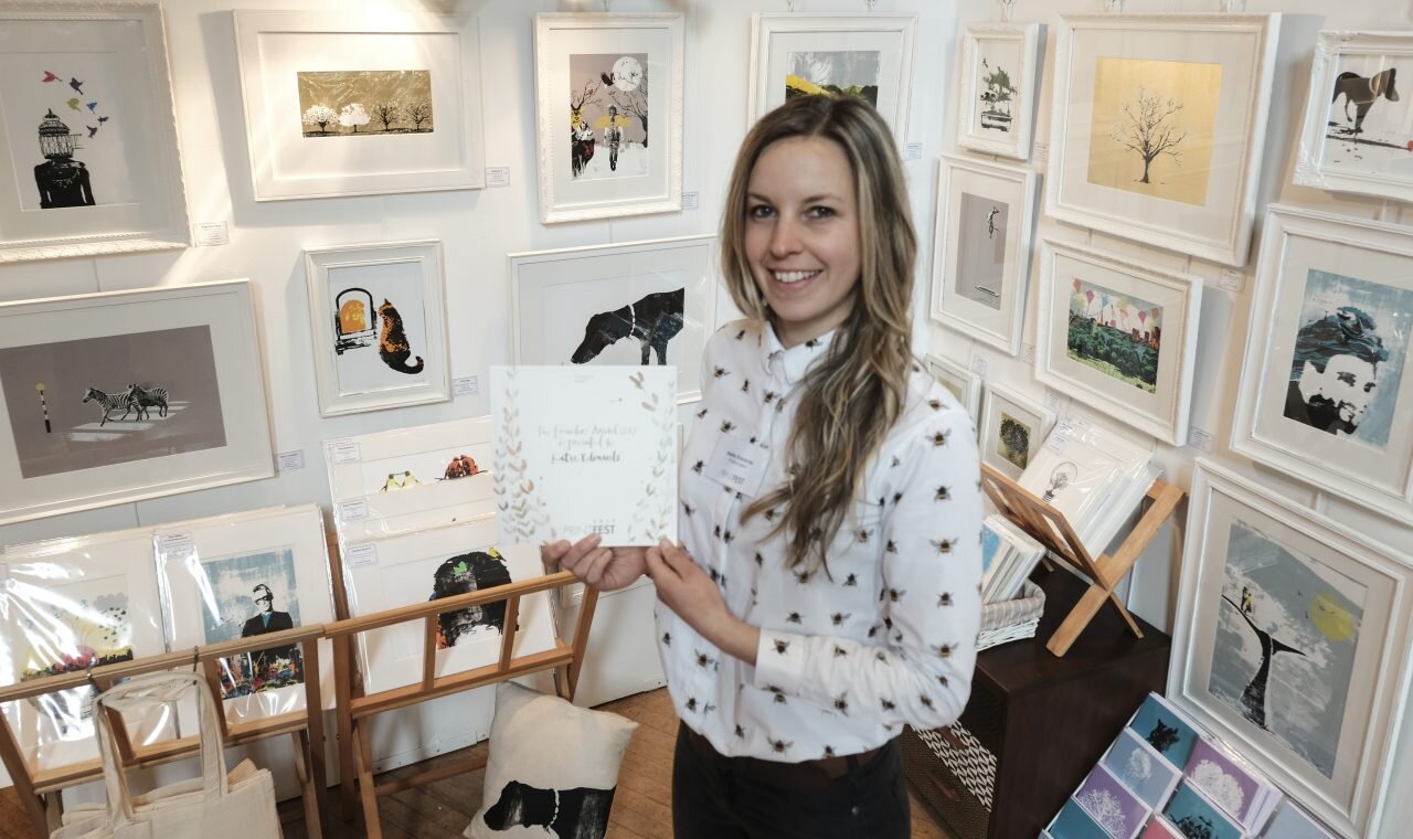
Katie Edwards, the up and coming Cumbrian artist from Newby Bridge who won The Founders at The recent Print festival in Ulverston. Katie's work has appeared in magazines worldwide and and she has a global client list. 

KatIe Edwards is dashing to finish a major project before grabbing her snowboard and heading for a holiday in Japan.

It’s a sentence that encapsulates three of her favourite things - art, travel and outdoor sports. But first she has to complete the project - a series of prints, some straightforward works of art and others with a functional purpose such as signposting the facilities at the Manchester apartment/hotel where they are destined to hang. Another batch will go nationwide to other hotels in the same group.

‘It’s a very exciting – the biggest project I’ve done,’ says the 32-year-old. ‘Some are quite small, quirky illustrations but others are ceiling to floor so it’s been a lot of work in a very short space of time. But I never miss deadlines – if necessary, I just stay up late.’

Lake District born Katie, a former pupil at Dallam School in Milnthorpe, has a growing reputation as one of the north’s top screen printers. Her illustrations appear regularly in national newspapers and magazines, such as The Observer and The Economist, and she has gained commissions from a diverse range of clients such as Booths, the National Australian Bank and Converse. Her prints intended to be hung on walls at home can be found for sale in galleries in the Lakes and Lancashire as well as further afield. Last year she won two coveted prizes, including the Founder’s Award at Printfest in Ulverston. ‘My previous award was in 2015 so to win two in one year was wonderful. It’s nice to have your work recognised.’

Katie Edwards, the up and coming Cumbrian artist from Newby Bridge who won Printmaker of the Year at The recent Print festival in Ulverston. Katie's work has appeared in magazines worldwide and and she has a global client list. 

After gaining a first class honours degree in graphic arts at Leeds Met, Katie spent four years working in London and some time in Canada. ‘Four years ago I came back to the Lakes,’ she says. ‘That had always been the plan. Why wouldn’t you? It’s such a lovely place.’

Katie, who is based in Newby Bridge, has managed to combine business with pleasure by completing a series of works featuring her mountain biking group, called One More Brew. ‘It was nice to do some illustrations on a subject that I’m really keen on,’ she says.

Not that her outdoor activities are restricted to biking – she walks her dog, snowboards, travels, is a fell runner, paddle boards and keeps herself supple with yoga.

Much of her work has a quirky, humorous even surreal element. It’s not a conscious thing – ‘I don’t consider myself a funny person’ – but the unexpected juxtapositions in her pictures make you smile. ‘There is usually an unusual object that’s out of place. For instance, a city scene with a wild animal.’

Like many printers, the joy of what she does comes from the element of surprise. ‘Screen printing is usually all about creating clean, flat images,’ she says. ‘But I like to create textures.

‘Each piece is slightly different, every one is unique. You need to know what you want to achieve but you don’t want to have too much control over it. Happy accidents are what I like!’

image.jpeg
tags: artist of the month, lancashire life, lancashire life interview, katie edwards lancashire life, lancashire life magazine
Friday 05.22.20
Posted by Katie Edwards
 

A Passion for Print

‘A Passion for Print’  interview in this Cumbria Life Magazine.

image.jpeg
tags: a passion for print, screen print interview, cumbria life magazine, cumbria life, cumbria life artist, cumbria life artist interview, artist interview, cumbrian artist, cumbrian screen printer, cumbrian illustrator
Friday 05.22.20
Posted by Katie Edwards
 

Fox Gloves

I was enjoying the Fox Gloves on my dog walks so much that I just had to make this mini silver leaf print, it seems that I wasn’t the only one and as soon as I posted this picture they went flying out to customers.

I have a few left in my shop.

12 cm square original Silkscreen Print on Silverleaf, edition of 10 only, £60.

image.jpeg
tags: fox golves, fox glove art, fox glove screen print, silver fox glove art, silver leaf screen print, silver, screen print, fox, glove, purple, flower art
Friday 05.22.20
Posted by Katie Edwards
 

Cut Flowers

‘Cut Flowers’ was commissioned for four Canal Boats named Daisy, Poppy, Rose and Forget Me Not. The four single pieces will go in the boats and the large piece in the owners home, such a lovely commission.

image.jpeg
daisy_framed_flower_gold_leaf_screenprint_katie_edwards_illustration_art.jpg
poppy_framed_flower_gold_leaf_screenprint_katie_edwards_illustration_art.jpg
rose_framed_flower_gold_leaf_screenprint_katie_edwards_illustration_art.jpg
forget_me_not_framed_flower_gold_leaf_screenprint_katie_edwards_illustration_art.jpg
tags: golf flowers, gold flower art, gold art, gold leaf art, gold leaf flowers, daisy, gold daisy, poppy, gold poppy, rose, gold rose, gold forget me not, forget me not, four gold flowers, cut flowers, cancel boat names
Friday 05.22.20
Posted by Katie Edwards
 

Manchester Legends, printing the final layer

Printing the final colour of my new ‘Manchester Legends’ screen print.

A ten colour screen print using 20 screens to make due to the length. This was a big and complicated print to make, but so worth it. I love printing the last layer and seeing it al come together. This piece was based on the artwork I created for Roomzzz Manchester Corn Exchange, it encapsulates everything about Manchester’s history and culture. Such a fantastic city full of colour and creativity.

The finished framed Manchester Legends

The finished framed Manchester Legends

The gold leaf version, Manchester Golden Legends

The gold leaf version, Manchester Golden Legends

tags: manchester, manchester hotel art, Manchester history, manchester art, Manchester hotel artwork, Manchester Roomzzz, Manchester culture, manchester Legends, manchester screen print, manchester illustration
Friday 05.22.20
Posted by Katie Edwards
 

The Financial Curse, The Guardian

Very excited to have 3 illustrations in Fridays Guardian. I have had illustrations in many newspapers before, but The Guardian was one I had aspired to work with since graduating. Only took me 11 years, but got there in the end.

The Finance Curse is about the idea that once a financial sector grows above an optimal size and beyond its useful roles, it begins to harm the country that hosts it. I used the analogy of a deep rooted blooming tree harming the seedlings and trees growing underneath it by starving them of light and water.

image.jpeg
image.jpeg
image.jpeg
tags: financial curse, financial illustration, editorial illustration, blossom tree, guardian, guardian illustration, financial sector, deep rooted tree, deep rooted tree anology, deep rooted tree analogy, lemon squeezer illustration, house of cards
Friday 05.22.20
Posted by Katie Edwards
 

Screen printing Rising Star II, 5 colour screen print

After the first edition of Rising Star sold out so quickly, Rising Star II is now available. This edition is bigger at A3 size and now available in the shop. Watch the video to see how I print this 5 colour screen print.

rising_star II_framed_listen_magazine_music_industry_social_media_record_screenprint_katie_edwards_illustration_art.jpg
tags: rising star, listen music magazine, record, guitar, twitter birds, city scape, music illustration, emojis, rain cloud, raining emojis, sunset, social media in music, art for a musician, gift for a musician, art for a music lover
Friday 05.22.20
Posted by Katie Edwards
 

The Art of Reprocessing, Thorp Plant Sellafield

The Art of Reprocessing is an exhibition held at the Beacon Museum in Whitehaven to celebrate the end of Nucleur Power Reprocessing at the Thorp Plant at Sellafield, Cumbria. The exhibition was put together by Forepoint and I was asked to create a piece illustrating the political debate that took place before Thorp was given the go ahead.

Here is the final layer being printed…

Here is the final piece, it was much larger than I usually work and had many layers.

image.jpeg
image.jpeg
tags: the art of reprocessing, beacon museum, nuclear power, thorp plan, sellafield, forepoint, political debate, political illustration, politics
Friday 05.22.20
Posted by Katie Edwards
 

5 tips to setting up an art fair exhibition....

I have done quite a few art fairs other the years, every show has there own preferred way of hanging your artwork so read their guidelines in advance and so that you have everything you need and have tried and tested it.

Here is me setting up for Manchester Art Fair, which is held in Manchester Central every Autumn.

Top Tips

  1. Make a plan - making decisions takes up so much time, so if you can plan your stand layout before you get there it really helps. You don’t have to stick to it but it’s a great starting point. I measure out my stand on the living room floor and place all my pieces where I want them, making sure there is room for any furniture and browsers. I like to really fill my stand, it suits my style of art, but other artists much prefer a more clean minimalist look, you choose what is right for you. Planning really helps when you are setting up a stand on your own which I always do, its hard to step back and see if a piece looks right when you are up a ladder, and on to point 2.

  2. Take a ladder - It helps so much and even though some fairs have them around to borrow, you know you won’t have to wait for one if you have your own. This does depend on high you intend to hang your work of course, I go pretty high up the wall to fit many pieces in.

  3. The right tools - I hung my first show with a hand screw driver, now I take a bradawl (to make the initial hole) and an electric screwdriver, its so much easier. Most shows that have a hard board display system prefer you to use screws over nails, as banging nails in can shake the stands and effect artists work hanging on the back of your stand. I don’t measure or use spirit levels but many artists do. Some show require you to hang pictures without screws as they don’t have the hard boards, wires and chains can be used to hang and they should give examples of how to do this.

  4. Get there early - I am usually one of the first to arrive, I’d much rather have time to sit down and eat some lunch than be still screwing things in as the first private view guests arrive. Pack your car the night before so you don’t have anything to do in the morning, its hard work lugging all your art around and setting up so the less you can do on the day the better. If the show is far away consider getting a hotel the night before so you aren’t knackered from the long drive and setting up. If you’ve not done one before it takes longer than you think so give yourself that extra time.

  5. Get some ideas - Go to some shows and get some ideas of how you might like to display your art, I have seen some artists put up shelves and then just lean their frames on them so they can switch and change them around easily. Enjoy!

Here is my Manchester Art Fair stand completed…

tags: exhibition tips, tips for setting up an exhibition, art exhibition, artist, tips for an artist, art fair, how to set up an art fair, 5 tipe to set up art fair
Friday 05.22.20
Posted by Katie Edwards
 

What to buy an adventurer...

Art makes such a great gift for an someone who loves an adventure or outdoor sports and travelling. ‘Sleep Eat Ride’ was a gift commission for a couple who travelled across America by bike, bikepacking, what and adventure. This screen print will remind them of their fantastic trip everyday. Scroll down to see me printing the last layer.

sleep_eat_ride_bike_packing_mountain_biking_mtb_bike_touring_screenprint_katie_edwards_illustration_art.jpg
tags: sleep eat ride, ride, cycling, cycling in the hills, cycling art, cycling with friends, art for cyclist, art for cyclists, gifts for cyclists, cyclist, bike packing, traveling by bike, tour biking, love to bike, cycling across america
Tuesday 05.19.20
Posted by Katie Edwards
 

How to keep travel memories forever....

The Taj Mahal was a commissioned birthday present for a couple who love to travel. This is a great way to gift a unique and thoughtful present, special to the receiver. I can use your photographs if you have some but I can work around this if you have an idea but don’t have the right images, or perhaps you have a few favourite images and you’d like to combine the different elements.

taj_mahal_india_mausoleum_travel_screenprint_katie_edwards_illustration_art.jpg
tags: taj mahal, Taj Mahal, Taj Mahl Art, Taj Mahal screen print, Taj Mahl illlustration, Taj Mahl painting, travel art, art for travellers, art for adventurers, gifts for adventurer, india art, india screen print, india painting, travel memories
Tuesday 05.19.20
Posted by Katie Edwards
 
Newer / Older
payment icons5.gif

Copyright © 2020 Katie Edwards Illustration Order Information